
Steps in Robin Hoods Bay - Work in Progress
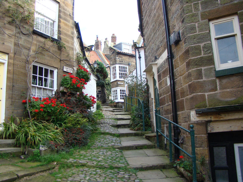
The subject of this drawing are some steps and cottages that I discovered in Robin Hoods Bay several years ago. I’ve decided to try and do it in pen. I’m not sure whether the scene will work without colour but it's something I'd like to try.
I’ve been trying to visualise the finished picture and I think I’d like to make the centre area around the steps the main subject, and it will need to include plenty of darks to make the lights work and to demonstrate the path narrowing between the tall buildings. Either side of the central steps I think I need to keep things fairly light, and I don’t want to fill the paper nor create a rectangular scene. Something along the lines of a vignette sounds good.
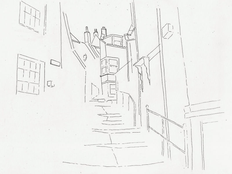
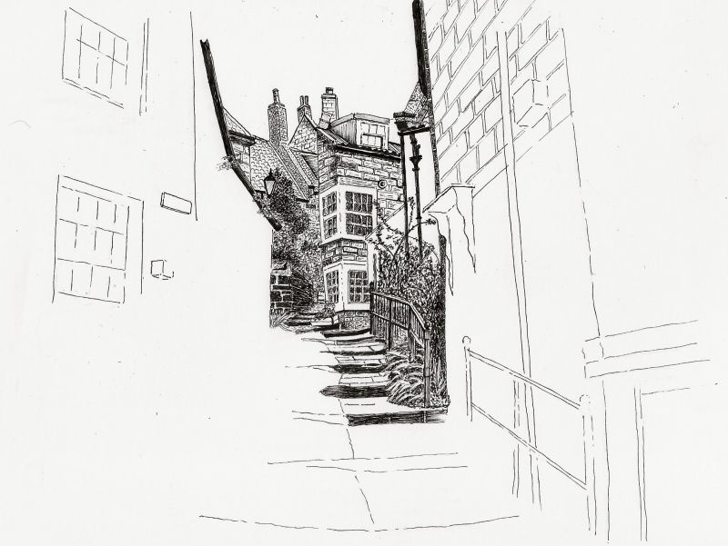
To start off I pencilled in the main shapes and then very lightly inked over them. I’m very much aware that you can’t remove inked lines once they’re down so you’ll see that for many of the lines I’ve allowed the pen to skip over the paper. And because you can’t remove inked lines it’s also important that I work from front to back …. In other words, draw in things that are in front of other elements first. At the moment I’m undecided about ‘hatching’ and hope to create the darker tones with more natural pen marks, but things like that will be dictated to me by the drawing as I get towards the end.
For those interested, I’m using Winsor & Newton Extra Smooth Surface Bristol Board (A4) and Pigma Micron Fineliner pens.
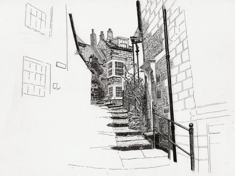
I was really stuck as to where to start with this one but finally decided to start in the middle and work my way out. Don't know why. And as for forward planning, I'm a bit worried that I've put in too many pen marks and made the first building too dark. In the photo it's supposed to be the lightest of the buildings, so I may need Artistic Licence to reverse the tones. Trying to make the surrounding buildings darker than this just won't work.
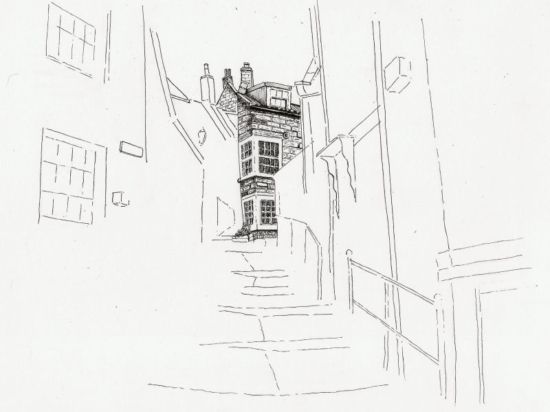
What I've realised is that I can't avoid the dark detail in the centre. Every pen mark adds 'dark', and there are so many marks needed in the middle area that I just can't keep it 'light'. As I work outwards, the scale gets larger and the marks will be more spread out, and the lightness will be unavoidable. I think it is, what it is, so I'm just going to let it develop naturally and see how it looks when I'm finished.
I'm really disappointed with the vertical line of the first building I drew ... dead centre. I was hoping it wouldn't be so obvious once I'd filled in around it but, if anything, it shows up more. I know people say that wobbly lines add character but at the moment that line is jumping out at me every time I look at the picture.
The latest additions also trouble me at the moment. There are a number of things that aren't sitting well with me and I'm sure I'll be revisiting them before I've finished, but I'm anxious not to make the area too dark so wish to be very considered over how many more pen marks I make there.
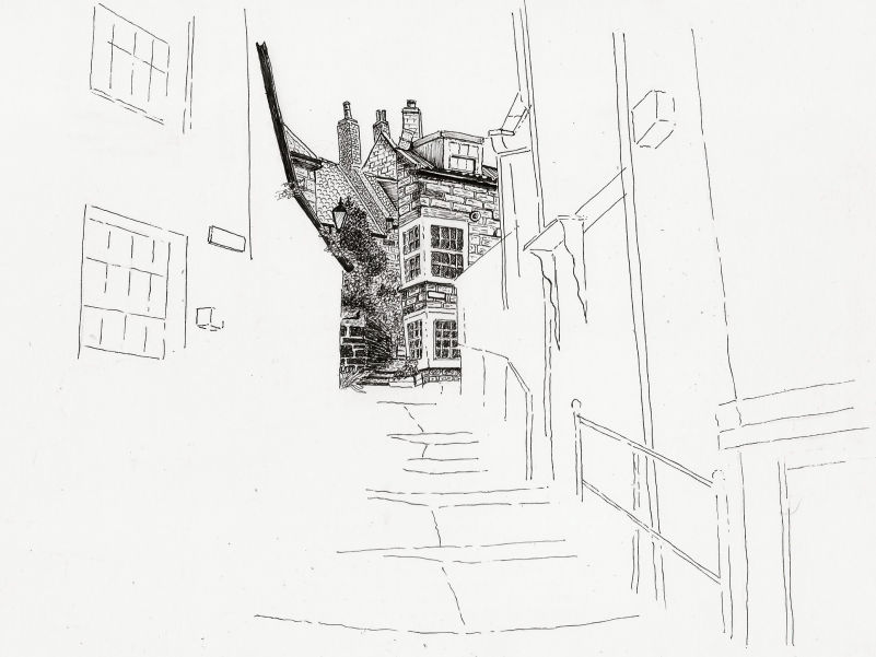
Progress is slow as I'm finding just making the pen marks quite time consuming.
It's very interesting trying to create different textures while still retaining lighter and darker tones. I'm also aware that the texture of the bricks needs to get larger as the bricks get nearer the foreground, but that may be going a step too far.
I'm not going to do too much more on the right side for now as I'm unclear as to how to tackle the vignette effect I want. I think I need to finish the prominent middle area first and then work my way out to the edges from there.

Since my site is all about encouraging beginners I'm not afraid to talk about my mistakes, and I've made a couple of bad ones.
I was at the stage where I needed to start on the left side of the scene but was concerned with regards to where to place all the foliage so I used pencil to sketch out where the main foliage types should go. Once happy I then started inking over the pencil marks. Because I didn't think about it enough I blindly followed the pencil lines and made the mistake of drawing too strong an outline to the Geranium flower heads. I should have reserved the shapes of them, allowing the background to define their shapes.
I've also gone in much too dark with the other shrub beneath the Geraniums (Cotoneaster I think) and there's nothing I can do now to lighten it. I don't think it's a show-stopper as I'm hoping that these mistakes blend into the rest of the picture as it fills in around them, but I'm kicking myself right now for not being more careful. Beginners note - these things happen.
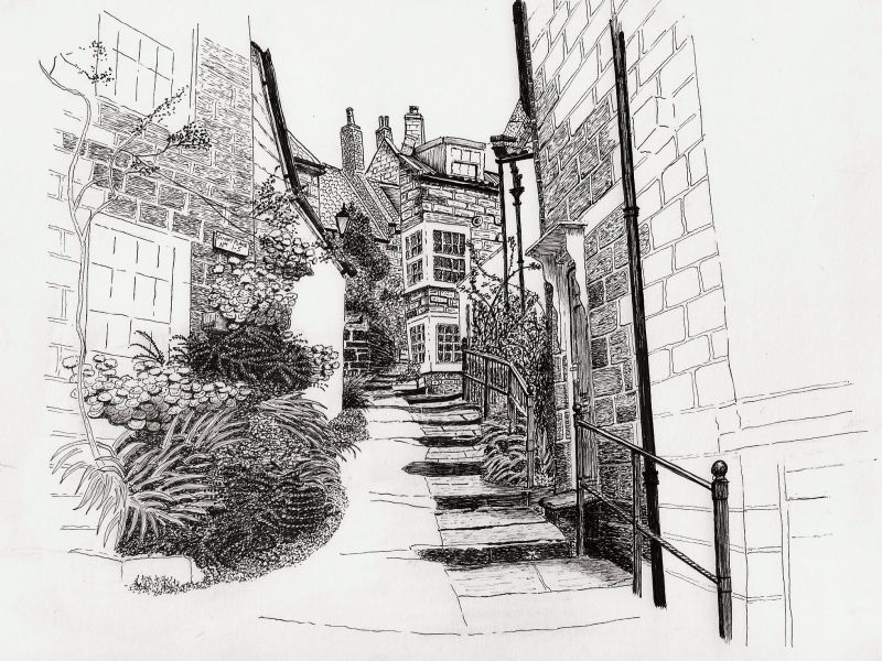
I've finished the foliage now and filled in some of the house wall behind. I'm feeling happy that the Geranium flowers have blended in fairly well and the dark tones beneath them don't stand out any more.
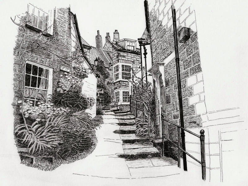
I've finished the left side of the picture now apart from maybe adding a few feint marks to create the vignette effect I'm looking for. All that remains now are the cobbles, which I've deliberately left till last, and then to finish off the right side in a way that balances what's on the left.
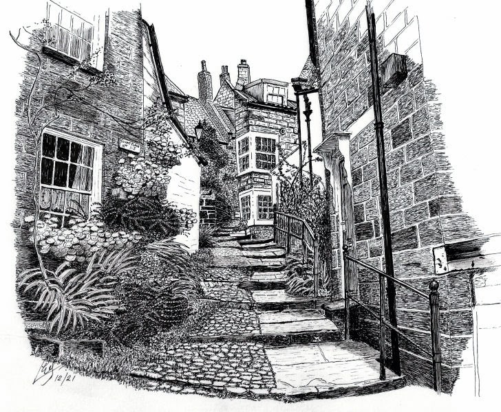
I've decided to call this finished. I could keep fiddling for ages but need to draw the line somewhere (excuse the pun). The vignette effect I was after hasn't worked as well as I'd hoped but I'm pleased with the white space around the scene which I think looks better than just filling the paper with marks.
Looking back at my original 'planning' for this drawing, I didn't exactly stick to the plan. That said, I think it was right to have an objective in mind as it helped me to be aware of when I was deviating from what I wanted to achieve.
Oh, here's a tip for any of you that may do pen & ink drawings. Don't throw away your pens when they run out of ink. Though they reach the stage of being fairly useless at drawing lines, they often still have enough in them to mark the paper and are extremely useful for light shading and very feint hatching, where distinct lines would be too much.
